Note
Click here to download the full example code
Introduction to Distributions
When you have a few chains and want to contrast them all with each other, you probably want a summary plot.
To show you how they work, let's make some sample data that all has the same average.
from chainconsumer import Chain, ChainConsumer, Truth, make_sample

# Here's what you might start with
df_1 = make_sample(num_dimensions=4, seed=1, randomise_mean=True)
df_2 = make_sample(num_dimensions=5, seed=2, randomise_mean=True)
print(df_1.head())
Out:
          A         B          C          D  log_posterior
0 -0.668065  4.875194   8.637756  15.725842      -3.216375
1 -2.484174  6.123240  10.946138  13.550658      -4.115756
2 -1.300656  5.926036  10.044298  14.147247      -2.621589
3 -0.102935  3.067071   8.375315  14.681300      -5.474791
4 -1.949402  5.115333  11.353940  12.323536      -4.419287
Using distributions
# And now we give this to chainconsumer
c = ChainConsumer()
c.add_chain(Chain(samples=df_1, name="An Example Contour"))
fig = c.plotter.plot_distributions()
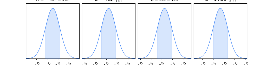
If you want the summary stats you'll need to keep it just one
chain. And if you don't want them, you can pass summarise=False
to the PlotConfig.
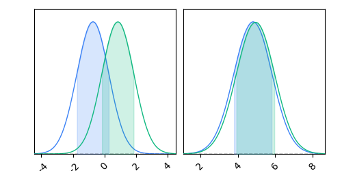
When you add a second chain, you'll see the summaries disappear.
c.add_chain(Chain(samples=df_2, name="Another contour!"))
c.add_truth(Truth(location={"A": 0, "B": 0}))
fig = c.plotter.plot_distributions(col_wrap=3, columns=["A", "B"])
Total running time of the script: ( 0 minutes 1.457 seconds)
Download Python source code: plot_3_distributions.py