Note
Click here to download the full example code
Introduction to LaTeX Tables
Because typing those things out is a massive pain in the ass.
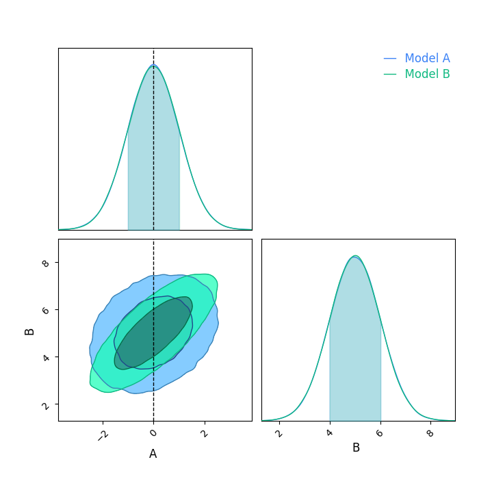
from chainconsumer import Chain, ChainConsumer, Truth, make_sample

# Here's a sample dataset
n_1, n_2 = 100000, 200000
df_1 = make_sample(num_dimensions=2, seed=0, num_points=n_1)
df_2 = make_sample(num_dimensions=2, seed=1, num_points=n_2)


# Here's what the plot looks like:
c = ChainConsumer()
c.add_chain(Chain(samples=df_1, name="Model A", num_free_params=1, num_eff_data_points=n_1))
c.add_chain(Chain(samples=df_2, name="Model B", num_free_params=2, num_eff_data_points=n_2))
c.add_truth(Truth(location={"A": 0, "B": 1}))
fig = c.plotter.plot()
Comparing Models
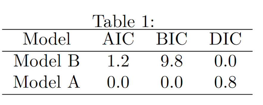
Provided you have the log posteriors, comparing models is easy.
Out:
\begin{table}
    \centering
    \caption{}
    \label{tab:model_comp}
    \begin{tabular}{cccc}
        \hline
        Model & AIC & BIC  & DIC  \\
        \hline
        Model B  &    1.2    &   12.1    &    0.0   \\
        Model A  &    0.0    &    0.0    &    0.8   \\
        \hline
    \end{tabular}
\end{table}
Granted, it's hard to read a LaTeX table. It'll come out something like this, though I took a screenshot a while ago and the data has changed. You get the idea though...
Summarising Parameters
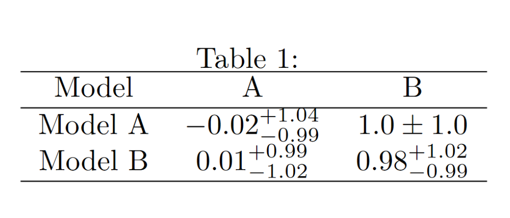
Alright, so what if you've compared models and you're happy and want to publish that paper!
You can get a LaTeX table of the summary statistics as well.
Out:
\begin{table}
    \centering
    \caption{}
    \label{tab:model_params}
    \begin{tabular}{ccc}
        \hline
                Model & A & B \\
                \hline
                Model A & $-0.03^{+1.04}_{-0.98}$ & $4.93^{+1.08}_{-0.94}$ \\
                Model B & $0.01^{+0.99}_{-1.02}$ & $4.99^{+1.01}_{-1.00}$ \\
                \hline
    \end{tabular}
\end{table}
Which would look like this (though I saved this screenshot out a while ago too)
And sometimes you might want this table transposed if you have a lot of parameters and not many models to compare.
Out:
\begin{table}
    \centering
    \caption{The best table}
    \label{tab:model_params}
    \begin{tabular}{ccc}
        \hline
                Parameter & Model A & Model B \\
                \hline
                A & $-0.03^{+1.04}_{-0.98}$ & $0.01^{+0.99}_{-1.02}$ \\
                B & $4.93^{+1.08}_{-0.94}$ & $4.99^{+1.01}_{-1.00}$ \\
                \hline
    \end{tabular}
\end{table}
There are other things you can do if you dig around in the API, like correlations and covariance.
Out:
\begin{table}
    \centering
    \caption{Parameter Covariance}
    \label{tab:parameter_covariance}
    \begin{tabular}{c|cc}
         & A & B\\
        \hline
        A &  1.00 &  0.27 \\
        B &  0.27 &  1.00 \\
        \hline
    \end{tabular}
\end{table}
Total running time of the script: ( 0 minutes 0.549 seconds)
Download Python source code: plot_2_textual_output.py